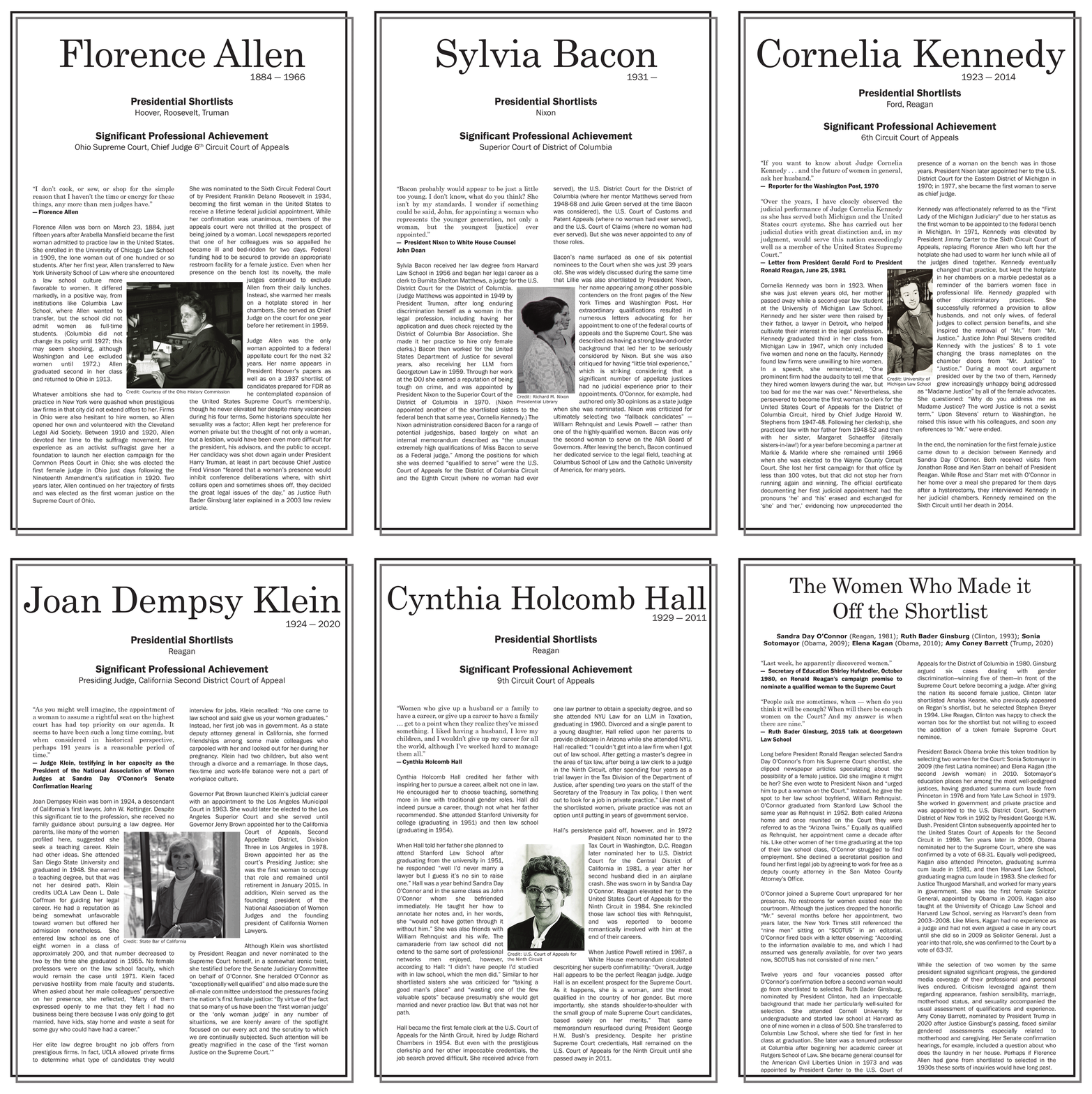
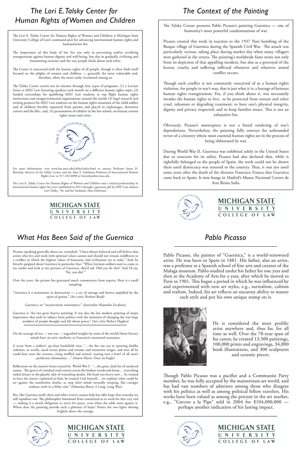
This design has won a Silver ADDY award at the local level of the American Advertising Awards, and won a Gold ADDY award in the Regional part of the awards. It is currently being sent to Nationals to be judged.
There's a surprising amount of illiterate people living their day to day lives in Lansing. Without basic literacy, many of the things we take for granted become impossible for them. Not only do simple tasks become a chore to do, but an illiterate person can easily be taken advantage of through the use of contracts. If they can't read, they don't know what they're signing away.
With this kind of promotional branding for the group in Lansing, I wanted to use shocking simplicity to get across the message that not everyone can read, and that it's a real and pressing issue that still needs to be addressed today. The text, to literate people, can still be read because the first and last letters of the words are in the right place, so your mind fills in the wrong letters and already knows what it's supposed to be. You know what you're signing away, but for those who can't read, they could be signing over their most precious belongings and never know until it was too late. You can see this by the signature line already being signed.
I created the brand with the idea of getting volunteers to help teach children and adults how to read and write with the help of this non-profit. The simplicity draws the reader in, but the subtle shock gets people to think about it later on, and to go to their website and learn more.
The current CALC website can be found here: www.thereadingpeople.org


